Don't Scale on a Weak Foundation

Power BI Analytics Layer Setup Across Business Units in an Indian Multi-Industry Enterprise

About Client

  • An established multi-service company based in India, operating across more than 7 business units and serving stakeholders at both regional and national zones.

Problem STATEMENT

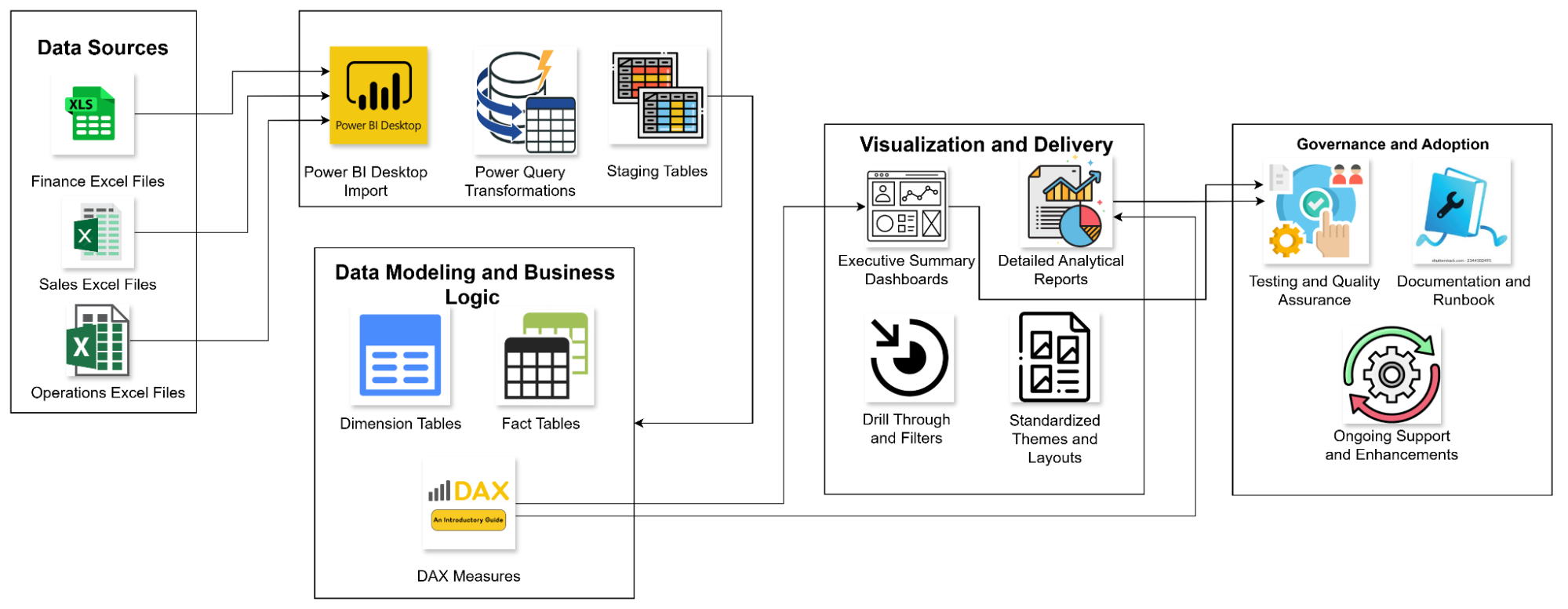
The organization as a whole was struggling with its management reporting process, which relied heavily on inconsistent Excel files. This made reporting slow, repetitive, and difficult to standardize across teams, limiting timely visibility for leadership and decision-makers.

  • Multiple Excel datasets were maintained across teams, each with a different structure, making consolidation and comparison difficult.
  • Reporting required repetitive manual processing, increasing effort, turnaround time, and the risk of errors.
  • There was no unified design approach or standardized KPIs, leading to inconsistent management reports.
  • Leadership had limited visibility into performance due to the absence of interactive, real-time dashboards.
  • There was no automated reporting process or supporting documentation, making reports hard to replicate and scale.

Solution

DataToBiz worked closely with the internal teams to bring structure and clarity to management reporting. Starting with Excel sheets, our team applied a design-first approach to build a cohesive Power BI reporting framework that leadership could rely on for quick, confident decisions. The solution included:

  • A consistent visual storytelling approach designed around how executives consume and interpret information.
  • Clearly defined and refined KPIs across revenue, margins, product performance, and region-level insights to ensure everyone was looking at the same numbers.
  • Intuitive dashboards that made it easy to explore data through quick summaries, drill-downs, and smooth navigation.
  • A unified design system created in Figma, bringing visual consistency, clarity, and scalability across all reports.
  • A flexible reporting architecture built to scale, supporting future automation and evolving business needs.
  • As a result, every dashboard delivered clear, accurate, and actionable insights that leadership could trust and act on.

Technical Implementation

  • Requirement understanding and KPI mapping
    The process began with detailed discussions to understand leadership expectations, reporting goals, and decision-making needs. Each KPI was carefully defined and mapped back to the available Excel data, ensuring feasibility, accuracy, and alignment from the start. 
  • Figma design and UI/UX prototyping
    Before any development began, the entire reporting ecosystem was designed in Figma. Layouts, colour schemes, fonts, visual styles, and interaction flows were finalised upfront, allowing stakeholders to visualise the dashboards early. These Figma designs then served as the single source of truth for Power BI development. 
  • Data modelling and transformation
    The team cleaned, validated, and structured the Excel datasets to ensure consistency and reliability. Data models were built with calculated fields, aggregations, and DAX measures, optimised for performance and long-term stability. Regular validations with stakeholders ensured the numbers stayed trusted and aligned. 
  • Power BI dashboard development
    All 15 dashboard screens were developed exactly as per the frozen designs. Interactive elements such as slicers, drill-throughs, cross-filtering, and KPI cards were implemented to support both high-level views and detailed analysis. Standardised themes were applied to maintain visual consistency across reports, with compatibility ensured for desktop-based sharing workflows. 
  • Testing, UAT, and refinements
    Each dashboard and KPI went through thorough quality checks and user acceptance testing. Feedback was incorporated through structured review cycles, allowing refinements without disrupting the overall design or data model. 
  • Documentation and training
    To support long-term adoption, comprehensive documentation was delivered, covering data architecture, transformation logic, and dashboard usage guidelines. Stakeholder training sessions were also conducted to help teams confidently use, interpret, and extend the reporting system over time.

Technical Architecture

Power BI Analytics Layer Setup Framework

Business Impact

Reduced manual reporting effort
Standardised data models and automated Power BI workflows cut manual reporting work by nearly 70%, freeing teams from repetitive Excel-heavy tasks.

Faster reporting cycles
Monthly management reports were generated about 60% faster, enabling leadership to review performance without long delays.

Higher data accuracy and consistency
Clearly defined and standardised KPIs delivered over 90% accuracy, ensuring every report reflected the same numbers across teams.

Improved executive readability
A design-first approach doubled presentation quality, making dashboards easier for leadership to read, interpret, and act on.

Eliminated version mismatches
With a single source of truth in Power BI, version conflicts and reconciliation issues were fully removed.

Real-time business visibility
Leadership gained instant access to revenue, margin, and product performance insights through interactive dashboards.

A dependable foundation for reviews
The new reporting system became the trusted backbone for management and performance review meetings.

With the centralized Power BI reporting ecosystem in place, the organization moved from fragmented Excel-based reporting to a scalable, reliable, and visually consistent analytics foundation. Decision-making became faster and more confident, operational transparency improved across departments, and management reporting was finally standardized at scale.

Related Case Studies

Drop Your Business Concern

Briefly describe the challenges you’re facing, and we’ll offer relevant insights, resources, or a quote.

Ankush

Business Development Head
Discussing Tailored Business Solutions

DMCA.com Protection Status